
Crafting a masterpiece.
Revitalizing an Italian brand with an artful aesthetic and savory textures.
Client
Gordon Food Service
Creative Direction: Katy Stafford
Art Direction: Amanda Mercer
Motion Direction: Morgan Tinney
Copywriting: Taylor Buekema
Photography: Big Event Studio
With a broad range of premium imported and domesticated products, there was no reason for GFS to be losing market share when it came to their Italian offerings. The issue was the brand—plain and simple. Tired and expected, Tavolini (known at the time as Famoso) needed a transformation. Our job was to take something that felt strikingly similar to a well known Italian chain of the early 2000s and turn it into a brand that felt authentically Italian, wholly distinct, and undeniably premium. After a robust competitive analysis, we landed on the rich and evocative brand you see here.
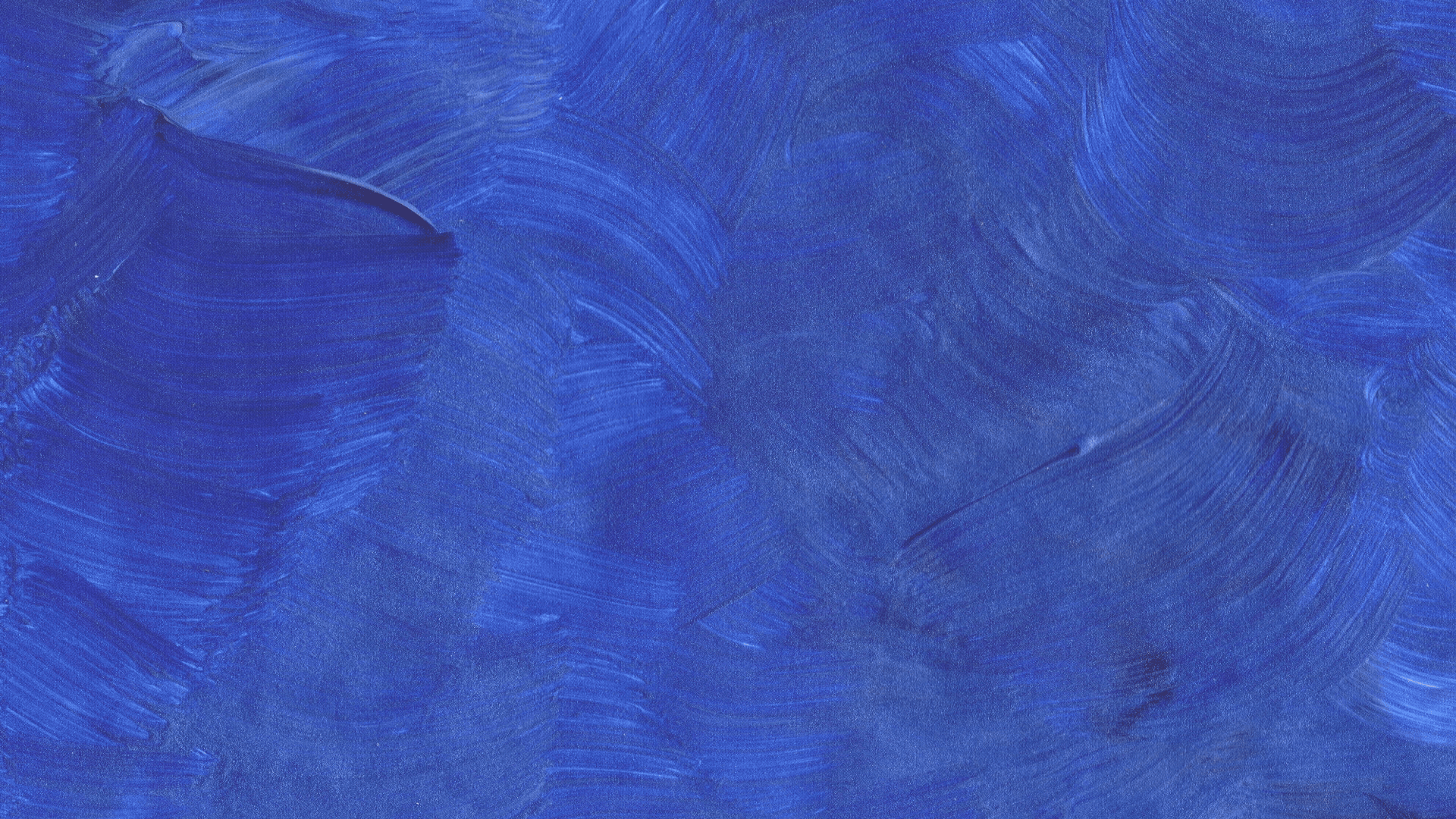
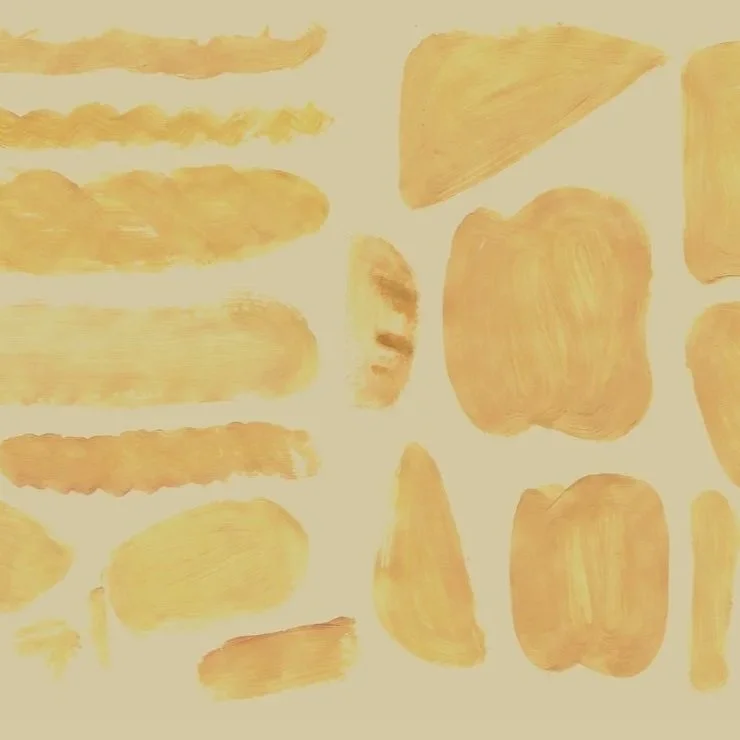
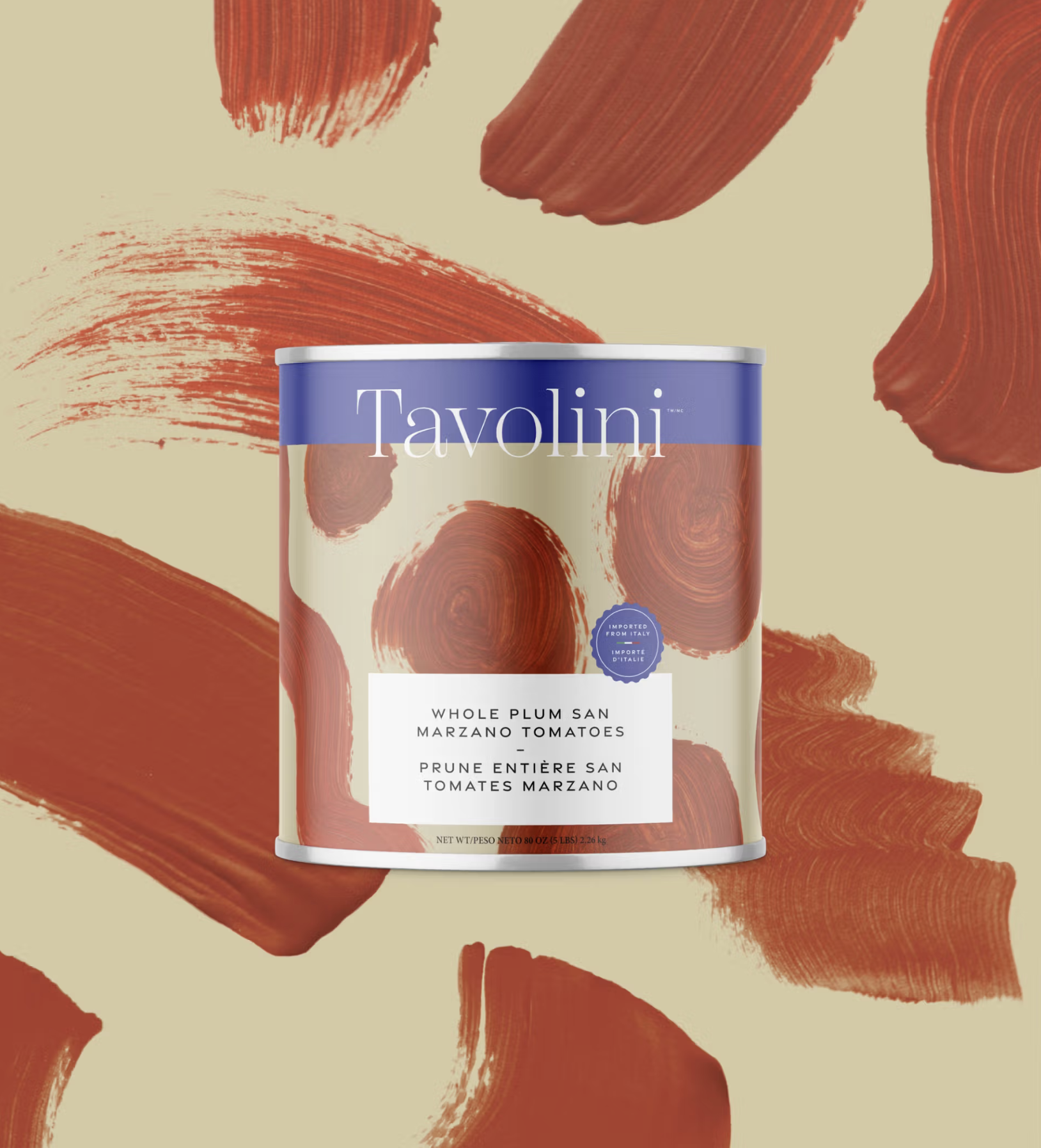
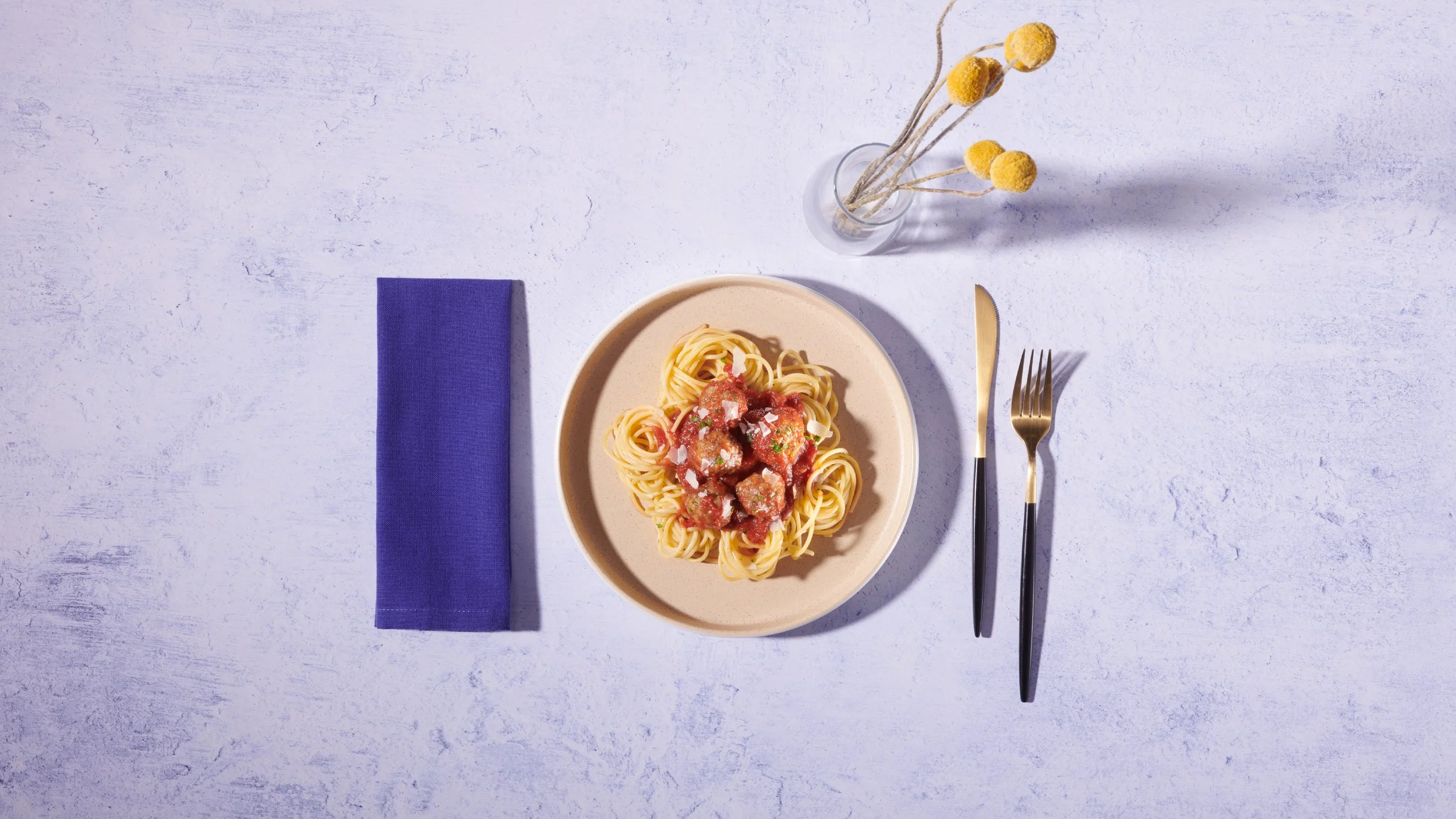
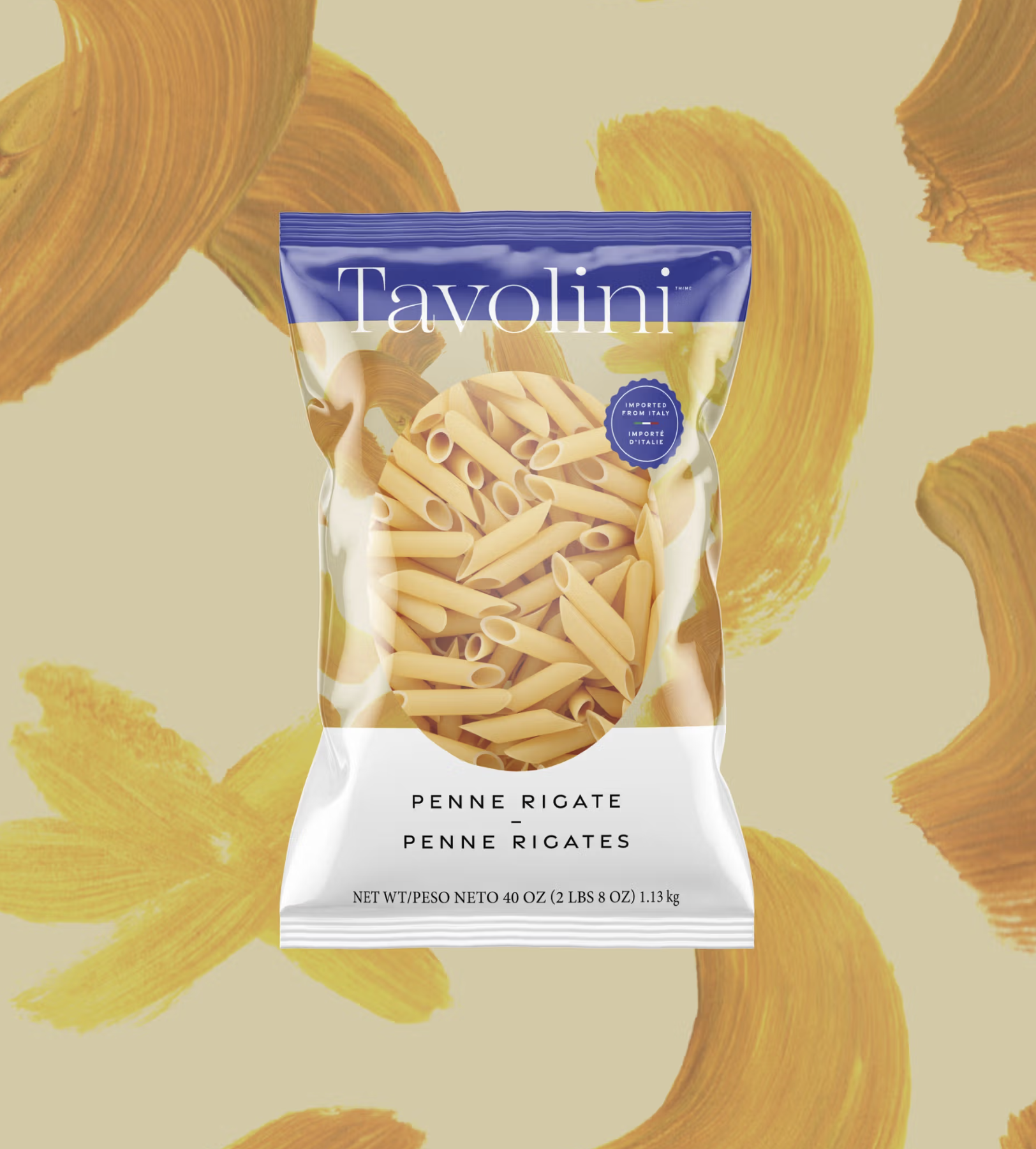
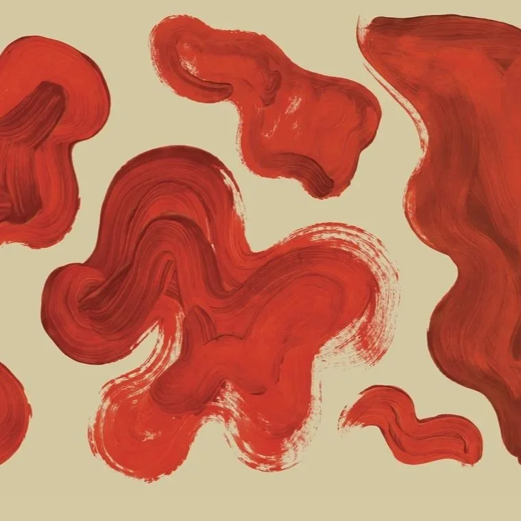
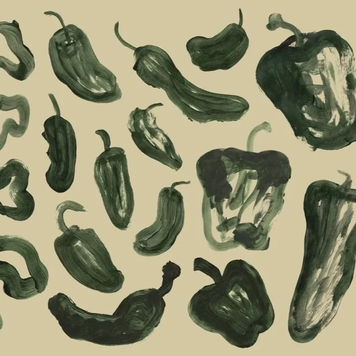
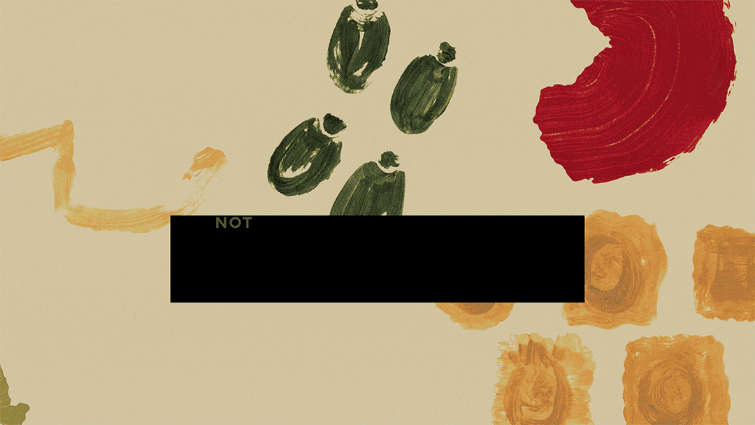
Grounded in a bright and alluring blue inspired by the waters of the Mediterranean, Tavolini positions the product as the vibrant ingredients any chef needs to craft a masterpiece. Every depiction of product is hand-painted and downright irresistible.
Getting
results
-
In just one year, the rebranded Tavolini drove $197 million in sales. The brand team had never experienced anything quite like it, cementing the power of brand in recapturing interest for an under-appreciated portfolio.
-
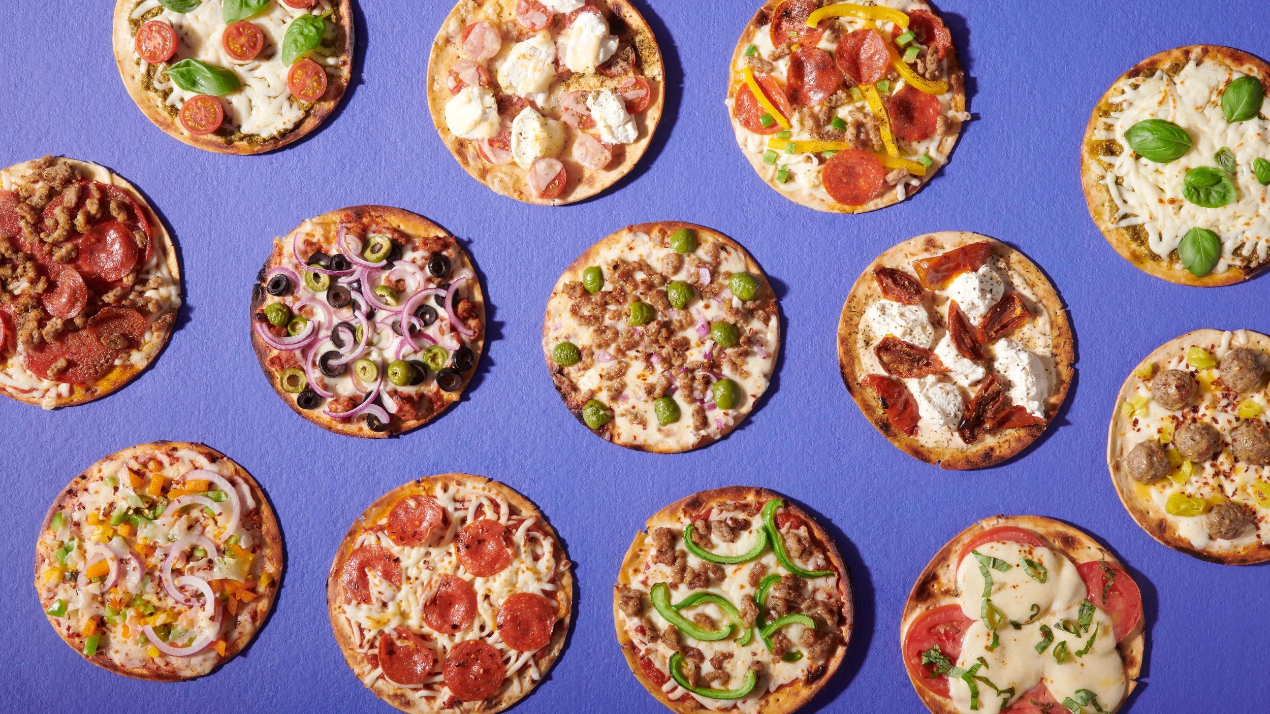
The new Tavolini brand looked and felt premium, driving new opportunities for product expansion with suppliers who were eager to white label and put their own products in the very best light.
-
The Tavolini portfolio continue to diversify and flourishes. Most recently, the brand asked our team to paint an art board for the packaging of their new and exclusive set of gelatos.